final production

|

|

|
I want part of my article to be an interview with Jess who is telling us all about her style and where she got her inspiration. This is my interview Q+A with Jess which I intend to include in my article page.
|
| ||||
|
|
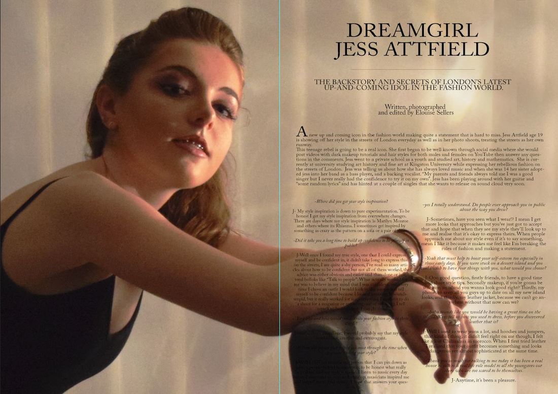
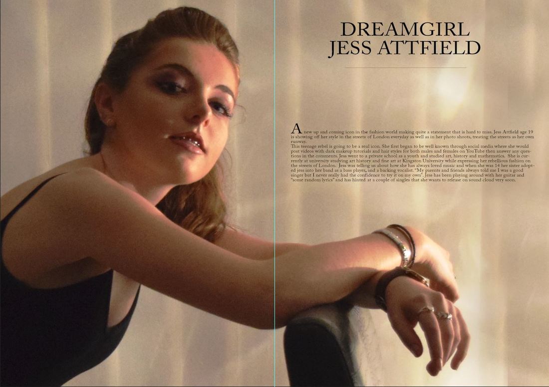
These two drafts were using my initial image that I was planning to use. The colour is warm and the light on the wall behind the model makes the picture more interesting. A problem I had with this background image is that where the text is covering her hands, it is not easy to read, After trying the text in different styles, colours and positions I decided that the background image had top change or move. This was when I looked at my research and decided on a black and white image that I only placed on half the page.
|
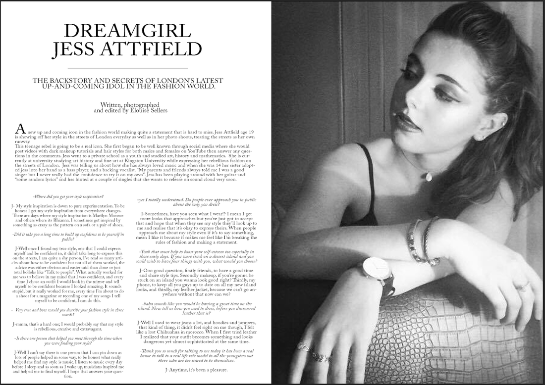
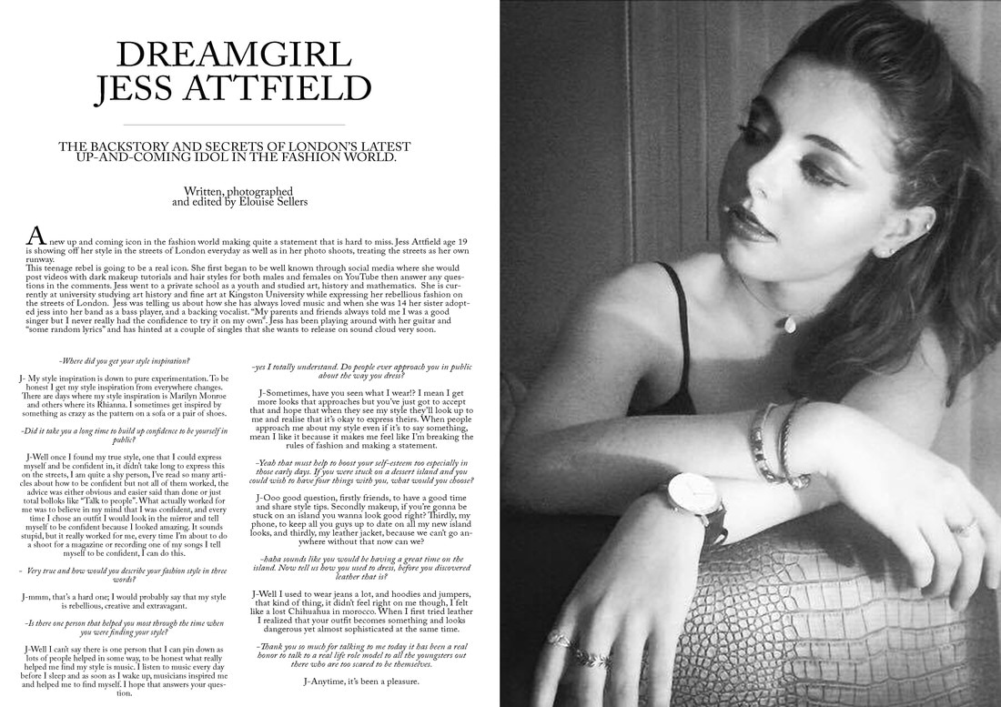
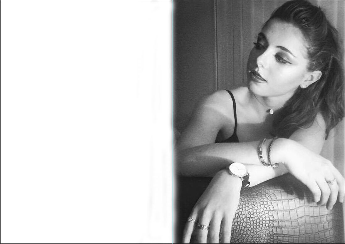
This is my second background imag that I have decided to try for my article page. I have done this as a half and half to follow the conventional layout like the articles from above. I really like this image as it is in black and white so looks quite sophisticated yet keeping the rebellious look using the makeup and hair. The model's mode of address is looking to the left which is where the text of the article will be, initially I had the image on the other side but looking at the other pages above the images are all on the right so I moved the image over and it now looks much stronger.
|
This is my final article and I am very happy with it. Initially I thought that the page would look too grey-scale however I think that the look is very sophisticated and neat. The first problem I encountered, was the bottom text, I couldn't find a way to make it all fit onto the page without it looking cluttered and too small to read. After trying different ways like putting the Q+A next to the background main text however that made the bottom of the page look overcrowded so I left the layers and would come back with fresh eyes. I had to consider the title and extras that needed to go on the page too. The main heading had to be big and bold so it was eye-catching and dominating. The sub heading also had to be bigger than the text though not as big and strong as the heading. I decided on this font style as it is slim and sophisticated giving my article a classic look. After finally getting the text layout right I decided to have the interviewer's dialougue in itallic so that it can be easily distinguished from that of Jess.