the finished contents page

|
|
possible photos
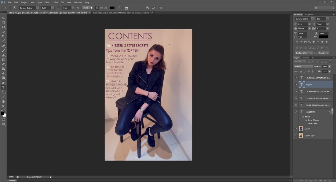
1st rough draft

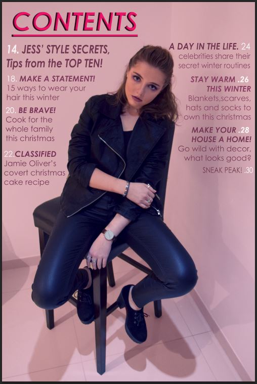
This is my first attempt at a contents page and I have much work to do on it. The colour palette is warmer and coloured unlike the cover page. Using the same model, I have selected a full body shot as the contents page in other magazines of the same genre generally use a full body shot of their model, where my model is looking directly at the camera to show direct address making it more personal for the reader. The writing at the moment is in a similar colour to the background making it slightly hard to read, however, I can edit and play with this making it look more sophisticated. I will have a full list of contents down the left side of the page, however, this is just a rough idea that I wanted to see what it looked like.
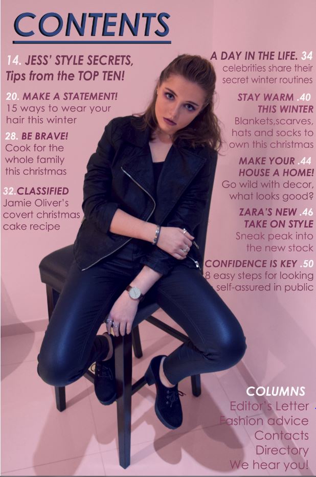
This is much stronger, using the same text colour as the colour of her lipstick. The top feature is in bold to show that it is anchorage text and this shows that it is the main article in the magazine. i like the look of the pink text with the white page numbers as it makes sure that the reader knows which pages the articles are on.
|
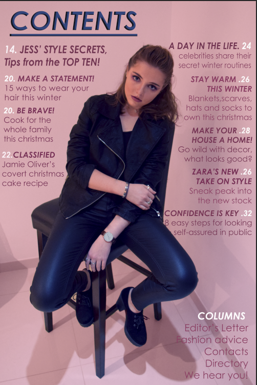
I am very happy with this contents page so far and I feel that it has improved a lot since the previous draft. I have been working on trying to get some house style through the cover and contents page. In order to do thisi put a ink overlay on the background of the image like on the cover and have now got the same colour on the font as the masthead. I was thinking about having the model in black ad white too but decided that it would then be too similar so decided to keep her in clour with the pink background. I hve also now made the headers of the pages in bold italic so that they stand out on the page and catch the audience's eye.
|
