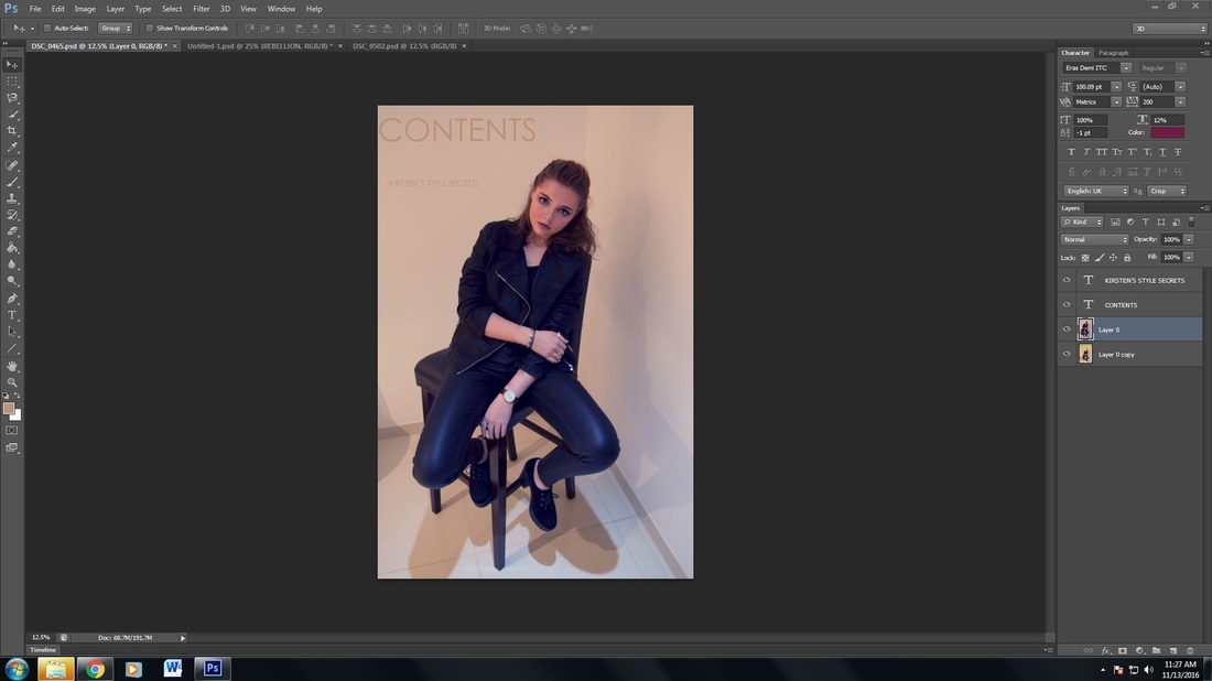
After putting the some initial covers together that I will revisit later, I have moved onto think about my contents page. Selecting 5 photos to choose from I now just need to play around on Photoshop and see what I can do.
|
|
These are my first contents pages and I am happy with them. I did think about having the contents page black and white like the cover however I asked several people which would be best and the winning outcome was to have the contents page in colour. I chose this image because I like the direct address and the high angle shot that looks down on my model. Her costume represents the rebellious character that I am aiming for. Her tilted body position gives a casual feel and the positioning of her arms reflects her defiance and need to challenge norms.
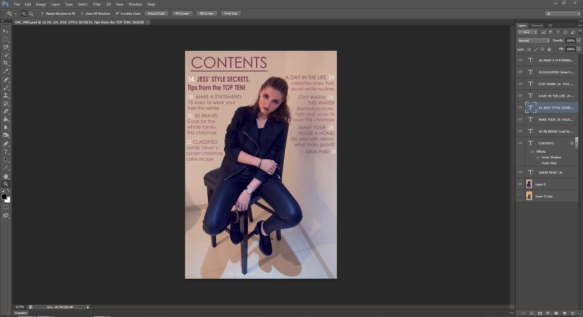
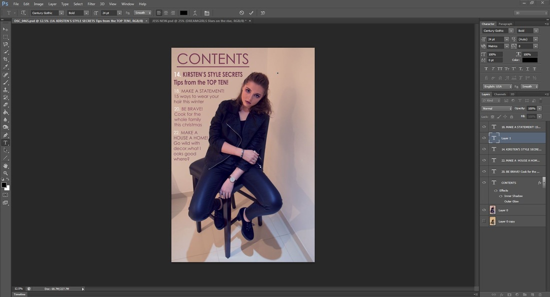
This is my most recent draft of the contents page. I really like the layout with the model in the middle looking at the audiece with direct address, which makes the page more personal. In 0rder to havce house style through the magazine, I would need to change the colour of the text to a brighter pink so that it is the same as the pink on the cover.
|
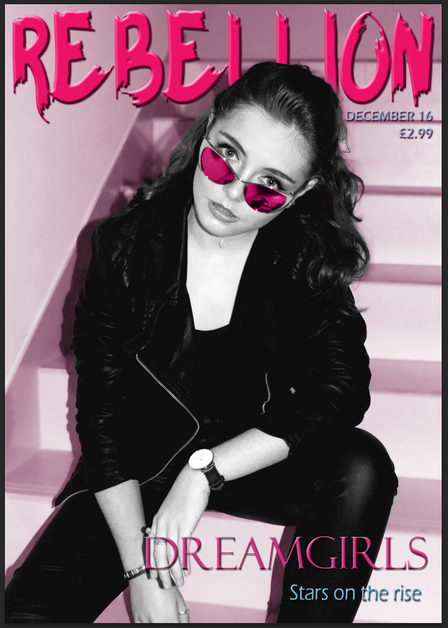
The most recent version of my cover is strong but I feel that the background doesn't work and doesn't represent the rebellion stereotype that I was hoping for. I really like the pink sunglasses complementing the pink masthead and colour overlay. I do like the stance and position that she is in, however with her sitting down it makes it hard to photoshop in a different background. The font of the masthead really works for me and I love it with the colour. I also like the idea of having the black and white model against the colour overlay background.
|
|
