I have been trying to improve my contents page by playing with the font and colours as well as positioning of the text.
|
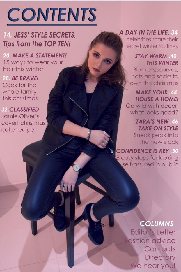
This is my contents page currently, the blue colour on the title is the same as on the models trousers making them stand out more. I have changed the font so that the text is much bolder. Having the page numbers in white makes them stand out however i need to alter the numbers as there are two 20's and so on. I really like this page so far and hope I can create the perfect look for my target audience.
|

This is my final up to date copy of my contents page with all the correct numbers. I am extremely happy with this page and think that mt TA would like it . The sell lines are in a slightly darker oink than the background with the main sub-headings in bold. The numbers were in the same bold colour however I thought that they needed to stand out much more so I chose to put them in white at the sides of the page. The main image on this page is not in black and white and is a long shot of the model sitting on a high, bar chair. Her jewelry, heels, clothing and makeup all contribute to the rebellious look of the image. I again chose to have the main colour of this page as pink just like on the cover so as to have house style on the pages. The blue colour on the masthead was taken from the model's trousers and i think that this colour really works and isn't too distracting from the main article headings.
|

My final draft of my cover is strong and I am pleased with it, at first I wasn't sure about the font for the anchorage text however I now feel that it makes the text eye-catching and bold for the reader. My main sell lines are on the left hand side so that when displayed in a shop, the main stories are shown clearly. The masthead is bold in a font that reflects the text. The colour is bright and contrasts the black of the models jacket, making her stand out. The colour also is the same as the pink on her sunglasses which reinforces the idea of rebellion. The main sub-headings on the sell lines are in a bold white so they stand out with the rest of the text in a narrow light pink colour, if the drop shadows weren't there then the text wouldn't of been seen. The anchorage text is located in front of the model and is bold in a light pink with the underline in a light blue so that they contrast each other and stand out. The font is bold and easy to read, grabbing the eye of my target audience. The main image denotes a girl sitting on some stairs using direct address to make the cover image more personal for the reader. Her posture is slouched over, slightly resting on her left knee looking casually cool. her costume represents a rebellious stereotype using leather trousers and jacket with metal framed pink cat-eye sunglasses that add to the whole look. This adds to the rebel look as it would seem strange that she is wearing sunglasses inside. My model does not have lots of makeup that is over the top because I thought the image might look too busy, so she has some simple winged eyeliner and lipstick with eye-shadow. I chose to have her in black and white so that she stood out from the pink background and was the main focus on the cover. I'm so happy with this and feel that all the conventions that I have used really work well together and my target audience would be attracted to this magazine.
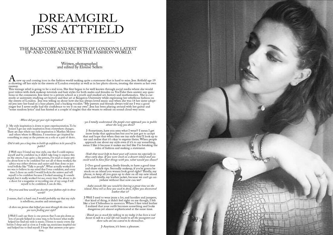
This is my final article page and I really love it. I feel that the colour scheme of black and white works really well and makes the cover look sophisticated which contrasts the fact that it is about a rebel teen. The image denotes my main model looking rebellious yet glamorous at the same time. This helps to make the page look more elegant but still reinforce the rebellious idea.
