general research
my magazine drafts
|
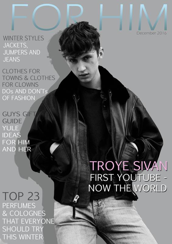
For this task we were told to find a picture from the internet and practice my Photoshop skills by creating a magazine cover in the genre of your choice. I chose this picture of Troye Sivan because he is one of my favorite singers and I really like his stance in this image. I thought about keeping the original image with Troye in colour and the background as a dull colour however I went with a grey scale colour palette because I thought it looked much more sophisticated and appealed to my target audience. I decided on a baby blue for the title as it is a stereotypical colour for boys, however, I added an ombre to turn it into black to suggest the transition from boyhood to manhood.
|
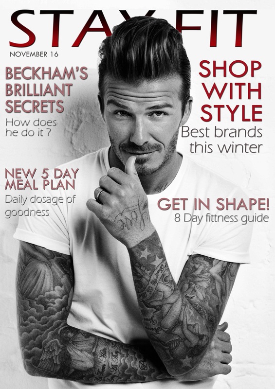
This was a timed challenge during class and we were given six different images of David Beckham, and we were instructed to choose the best one and create a magazine cover. To start with I was going to change the background however the white t-shirt and the background blended and it was messy when I deleted it, So I kept the same background to save time, however, I wanted to place the masthead behind David Beckham's head so I had to delete the top half of the background and blend the two backgrounds together. Most of this magazine I got done during the time frame in which it was set, however, I went back after and did my final touches like moving text and changing font and colour.
|
magazine analysis
|
|
|
genre research [covers]
|
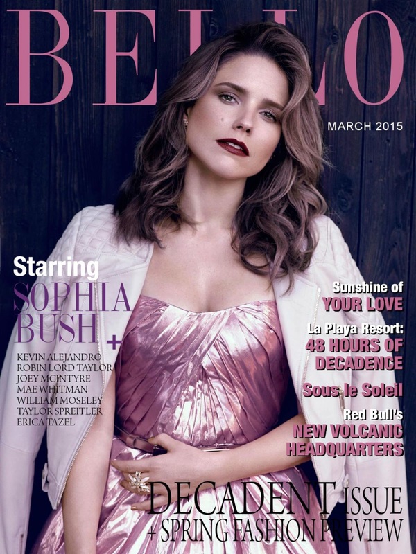
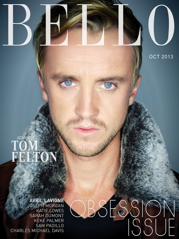
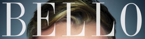
Bello magazine
|
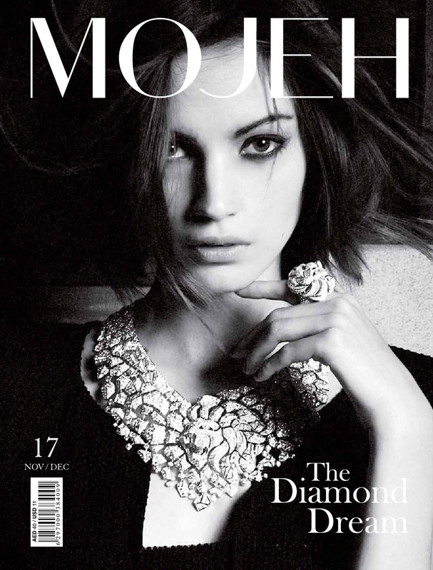
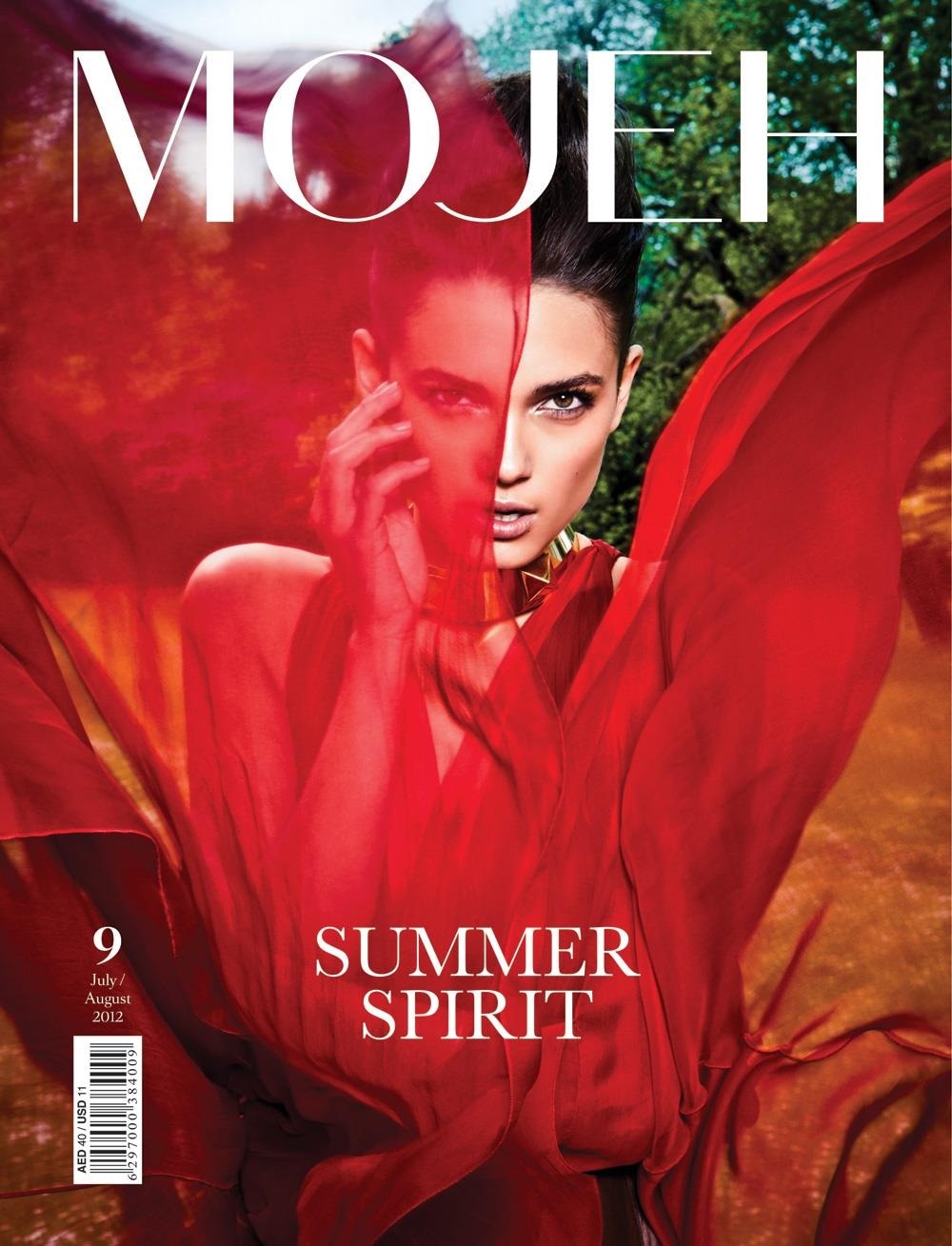
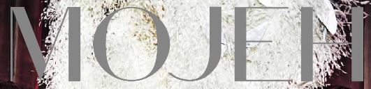
mojeh
|
Stylish, sophisticated and elegant, MOJEH Magazine is the go-to fashion resource for luxury at its finest. Created in 2011, in response to a burgeoning market of stylish and sophisticated women within the Middle East who desired a high-end fashion and lifestyle resource to match their vibrant lifestyles, MOJEH is the go-to fashion resource for luxury at its finest.
|
|
|
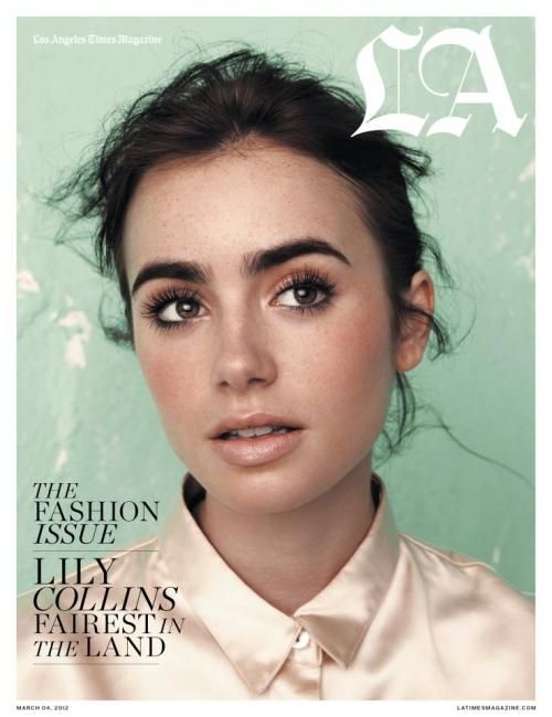
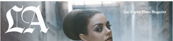
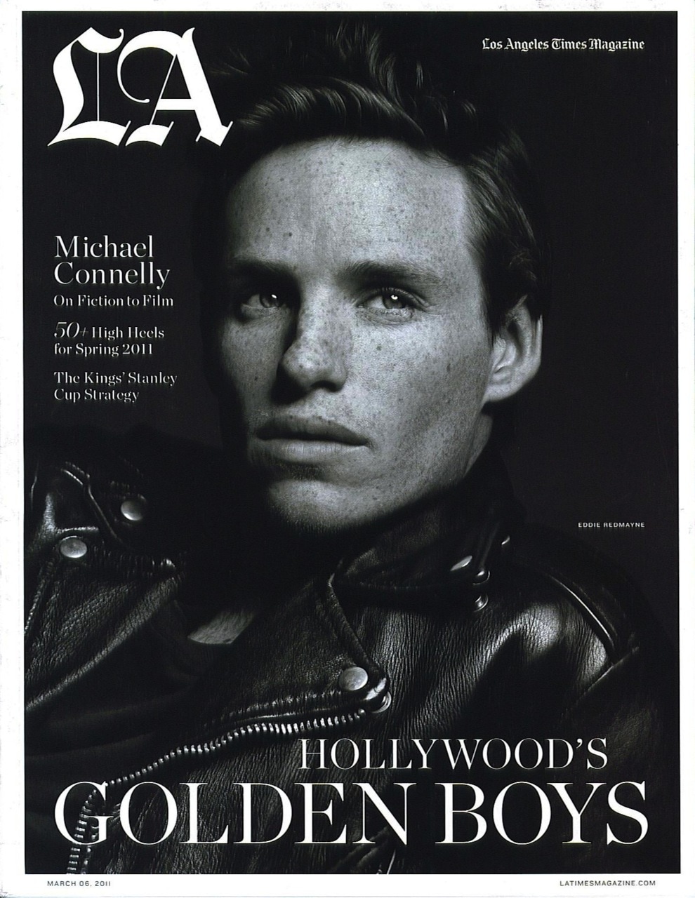
LAThe definitive resource for Angelenos, Los Angeles covers the people, food, culture, arts and entertainment, fashion, lifestyle, and news that defines Southern California with a signature mix of feature-length writing, service journalism, investigative reporting, and design.
|
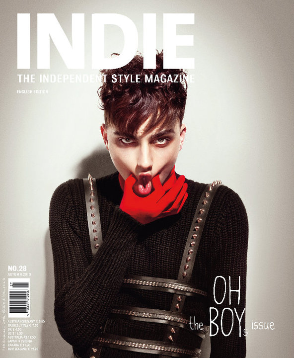
indie magazineIndie is innovative fashion- and photo-editorials by internationally renowned photographers and portraits of budding talents from the fashion, music and art scene are INDIE's main cornerstones
|
|
deconstruction of a magazine cover [analysis]
|
|
|
cover conventions
Masthead

|
|
|
Both of these mastheads are sophisticated and stylish. They are simple and not too bright or bold making them complement the image and are easy on the eye. The masthead is always positioned across the top third of the cover and depending on length, will usually be central from one side all the way to the other. LA magazine has now changed its Masthead and it now covers the whole top third similarly to Mojeh magazine and Bello magazine. The overall look of the new masthead is now less sophisticated and more child -friendly looking, however, it is still bold and eye catching covering the top third.
main image
|
|
|
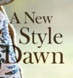
Usually a head shot of the model using direct address or just past the camera. The image dominates the cover and usually over laps with the masthead.
anchorage text
|
|
|
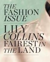
Anchorage text is easy on the eye and stands out against the background. the font is sophisticated and capitals are used to draw attention to the important parts of the text.
font styles
|

|
|
Font is sophisticated and appeals to the demographic because it represents the higher society. Capitals are used to make the text bold and eye catching.
colour palette

|

|

|
Colour palettes usually reflect the time of year that the edition of the magazine is being released. For example, a summer magazine might be really bright and colourful using reds, oranges and yellows however a winter cover might be in colder blues and whites perhaps with some grey. The costume will always contribute to the colour palette and attract the eye of the target audience, making them want to read the magazine and for this demographic.
